
Brand Identity for
Orca Talent Partners
Tasked with creating the brand identity for Orca Talent Partners,
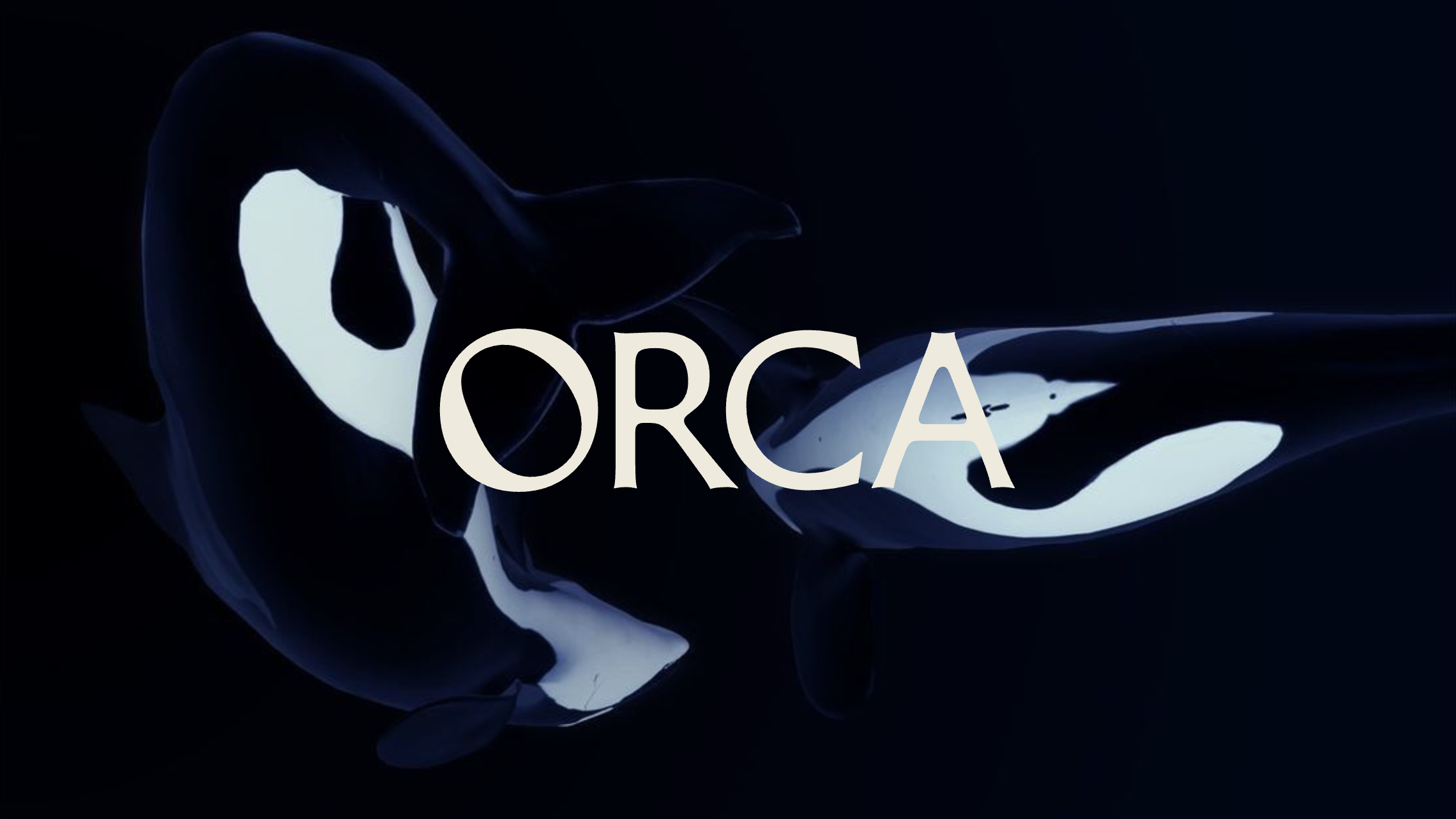
we tapped into the energy the apex predators bring to getting what they want.
New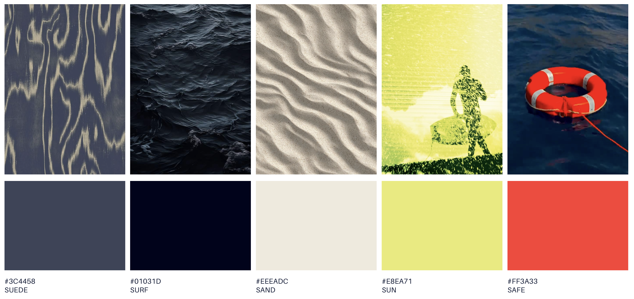
COLOR PALETTE
By using the environmental colors, we create a well rounded brand that feels in tune with the emotionally rich and sophisticated animal. A pale yellow and a striking red are offered to accompany our cool tones.
Option to use one or both as a pop of color.
FULL LOGO SUITE
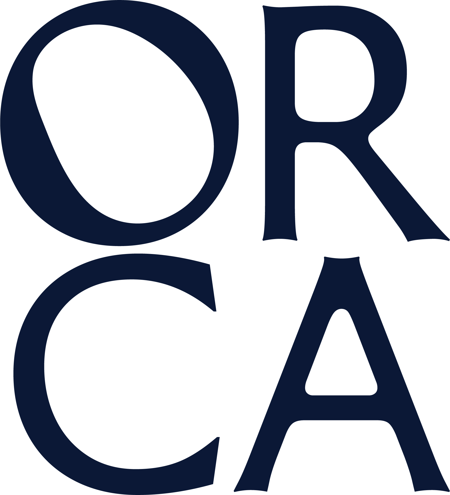
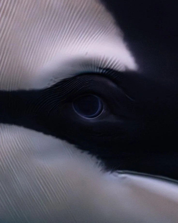
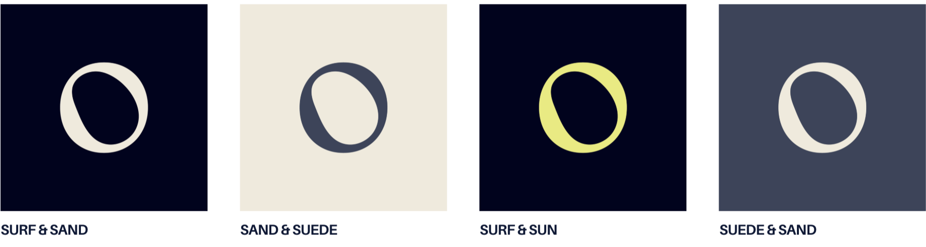
A subtle use of the shape of the orca’s eye fills the negative space within the ‘O’, resulting in a memorable brand mark to identify the brand.
WORDMARK

FULL ONE LINE

O SYMBOL
STACKED

FULL

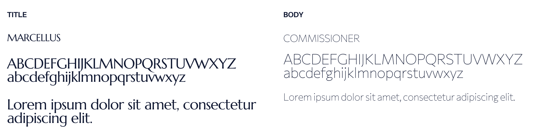
TYPEFACE
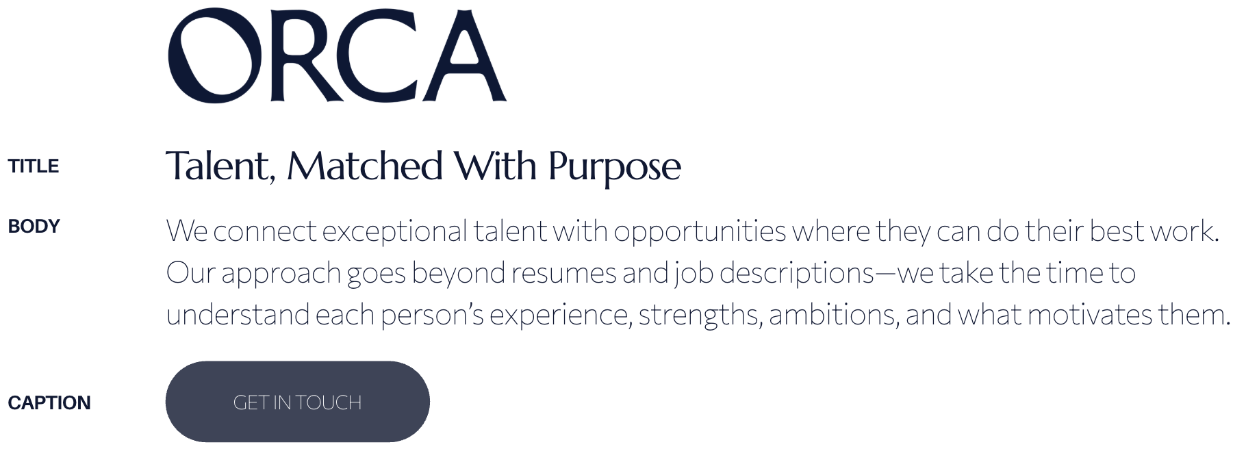
IN SITU — WEB
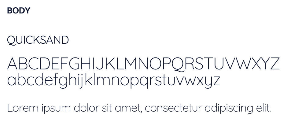
ALTERNATE BODY TYPEFACE
DIGITAL ASSETS
SOCIAL PROFILE PHOTOS
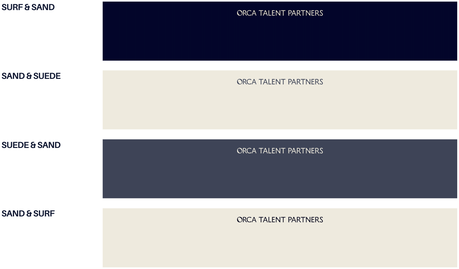
SOCIAL PROFILE HEADERS
SOCIAL TEMPLATES


